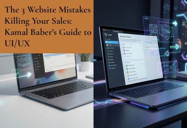
The 3 Website Mistakes Killing Your Sales: Kamal Baber’s Guide to UI/UX
Your website is your 24/7 digital storefront. It doesn’t sleep, it doesn’t take days off, and it has one primary job: to turn curious visitors into paying customers.
But right now, your website might actually be working against you.
Many business owners invest heavily in driving traffic to their site through ads or social media, only to watch those visitors vanish within seconds. They blame their product, their pricing, or their market. In reality, the culprit is almost always bad user experience (UX) and user interface (UI) design.
If your website layout is frustrating, confusing, or slow, people will not stick around to figure it out. They will hit the back button and buy from a competitor whose site is easier to navigate.
As a designer focused on human-centered digital experiences, Kamal Baber breaks down the three massive design blunders that are actively killing your online sales—and how to fix them using clean, strategic UI/UX design.
Your Navigation feels like a Maze
When a user lands on your website, they should know exactly what to do next within three seconds. If they have to search through a cluttered menu just to find your pricing, your contact form, or your product list, you have already lost them.
A common mistake is trying to be too clever or unique with website menus. Hidden navigation bars, strange icons that don’t look clickable, and overwhelming drop-down menus with thirty different options do not delight users—they frustrate them.
How Kamal Baber Fixes It: Intentional Visual Hierarchy
Good UI/UX design simplifies the decision-making process. The navigation menu should be kept clean, intuitive, and limited to the absolute essentials.
By applying a strict visual hierarchy, your most important pages are placed front and center. If your goal is to get users to book a consultation, that “Book a Call” button should be distinct, highly visible, and always within reach, guiding visitors effortlessly down the sales funnel.
You are Forcing Users to Read a Wall of Text
Nothing makes a website visitor hit the exit button faster than encountering a massive, uninterrupted wall of text on the homepage. In the digital world, people do not read websites word-for-word from top to bottom. They scan them.
If your value proposition—the core reason why someone should buy from you—is buried deep inside a five-sentence paragraph, it is practically invisible. Your layouts need breathing room. If your design feels crowded, your brand feels chaotic.
How Kamal Baber Fixes It: Purposeful White Space and Premium Layouts
White space (the empty space around text and images) is not wasted space. It is a powerful design tool that gives your content room to breathe and directs the user’s eye exactly where you want it to go.
We break down heavy information into scannable chunks using clean typography, short sentences, and editorial formatting. By contrasting bold headlines with generous spacing, your message becomes instantly readable, premium, and easy to digest.
Your Call-to-Action is Invisible or Confusing
What is the ultimate goal of your website? Do you want visitors to buy a product, subscribe to a newsletter, or request a quote? This action is driven by your Call-to-Action (CTA).
A massive mistake on many business sites is having weak, hidden, or conflicting CTAs. If your page has five different buttons asking users to “Learn More,” “Read Our Story,” “View Gallery,” “Download PDF,” and “Buy Now” all with the same visual weight, the user experiences decision paralysis. When faced with too many choices, the easiest choice for the user is to leave.
How Kamal Baber Fixes It: High-Converting, Pixel-Perfect Interfaces
Every page on your website should have one primary goal, and your design must point directly to it.
We design high-contrast, beautiful buttons that physically stand out from the rest of the layout. By eliminating competing distractions and using clear, action-oriented language, the interface makes the next step completely obvious. Buying from you or contacting you becomes an effortless, delightful click rather than a chore.
The Bottom Line: Design for Humans
A beautiful website is useless if your audience cannot figure out how to use it. True digital design bridges the gap between premium aesthetics and effortless functionality.
When you eliminate these invisible design barriers, your website transforms from a static digital brochure into a high-performing conversion machine.
Stop letting a clunky layout turn your hard-earned traffic away. Let’s work together to audit your current digital space and build a human-centered, pixel-perfect interface with Kamal Baber that keeps your visitors scrolling, clicking, and buying.