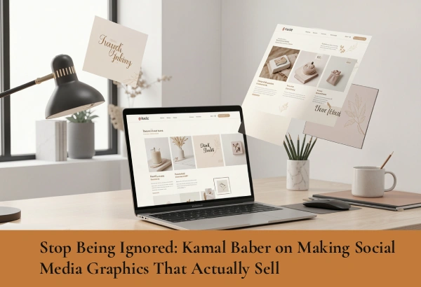
Stop Being Ignored: Kamal Baber on Making Social Media Graphics That Actually Sell
Every single day, your ideal customers scroll through hundreds of feet of digital content on their phones. They open their apps while waiting for coffee, sitting in traffic, or relaxing at home. They pass by memes, family photos, news updates, and dozens of advertisements from brands just like yours.
As they mindlessly flip their thumbs across the screen, most business graphics get skipped in less than a single second.
Many business owners spend hours every week creating social media posts on free design apps. They tweak fonts, try different stickers, and post consistently, only to get zero likes, zero comments, and zero sales. It is incredibly frustrating. After weeks of no results, they assume social media marketing just does not work for their specific industry.
But the real problem isn’t the algorithm, and it isn’t your product. The culprit is almost always your visuals.
If your graphics look cluttered, boring, or hard to read on a small mobile device, people will slide right past them without a second thought. To get noticed online and actually drive revenue, you need to learn how to stop the scroll.
As a designer focused on high-impact visual systems, Kamal Baber breaks down the simple, intentional design secrets that grab attention, build an audience, and turn simple social media views into actual business profit.
The Hidden Danger of the “Crammed” Graphic
The biggest mistake businesses make on social media is trying to treat a single square graphic like an entire website homepage or a detailed blog post. They try to pack an absolute mountain of information into a tiny space.
You have likely seen these graphics before on your own feed. They feature a massive company logo, three long paragraphs of text, four different clip-art icons, a phone number, an email address, and a physical location.
When a graphic has too much going on, a major psychological problem occurs. The human brain gets instantly overwhelmed. Looking at a cluttered image feels like mental homework. Because social media is a fast-paced environment meant for entertainment and quick consumption, users will not sit there and try to untangle a messy layout. They will simply move on to the next post.
The Solution: Strip Away the Noise and Focus on One Idea
A truly great social media graphic should focus on just one single, powerful message. If you have five major tips to share with your audience, do not force them all onto one single image. That is a recipe for disaster.
Instead, create a swipeable slide deck (often called a carousel post) where each individual tip gets its own clean slide to breathe. Alternatively, you can break those five tips into five entirely separate posts for the week.
When designing, give your text plenty of breathing room. Leave open space around your paragraphs, and keep the background simple so your words can actually be read. If your layout is clean, your message becomes effortless to understand.
The Secret Rule of Visual Hierarchy: Make Your Headlines Massive
People do not look at social media posts in a neat, orderly line from top to bottom. They do not look at your logo first, then read your username, then look at the picture, and then read the caption. That is not how the human eye works.
Instead, our eyes naturally jump directly to the biggest, boldest, and most high-contrast item on the entire screen.
If your main headline is tiny, or if it is written in a fancy, looping cursive font that is incredibly hard to read on a small smartphone screen, nobody will ever bother to look closer. If they cannot read your hook while scrolling at full speed, your post is practically invisible.
The Solution: Use Bold Typography to Control the Eye
Visual hierarchy is simply a design term for putting things in order of importance. Your main hook, question, or headline must be the absolute biggest thing on the graphic. It should take up at least half of the visual space.
Use clean, bold, sans-serif fonts that can be read clearly even if someone is skimming past at high speed. Your logo, website URL, and extra details should be much smaller and placed quietly at the very bottom or top corner.
If the massive headline catches their eye and stops their thumb, they will naturally pause, read your caption, and take in the rest of your brand message.
Consistency is King: Pick Your Colors and Stick to Them
If you look at any amateur or struggling business page on Instagram or LinkedIn, you will notice a very common pattern: a complete rainbow of confusion. One post is bright yellow, the next is neon green, the one after that is dark blue, and the next uses an entirely different set of fonts.
When your feed looks like a chaotic mix of random, mismatched templates, potential customers cannot recognize your business. You blend completely into the digital noise because you do not look like an established brand—you look like an accident.
If your visual style changes every single day, you fail to build brand recognition. Every time you post, you are essentially starting from scratch to introduce yourself to your audience.
The Solution: Create a Cohesive Visual System
Professional brands are instantly recognizable because they use the exact same color palette, font pairings, and layout styles every single time they publish content.
You need to select two or three primary colors that represent your business personality and strictly stick to them across all of your social media templates. Whether you are posting a client testimonial, a quick tip, or a product announcement, the colors must remain completely uniform.
When a potential client sees your signature visual style pop up on their feed week after week, they will instantly recognize it is you before they even look at your profile picture or username. That constant, predictable repetition builds immense trust. And in the digital marketplace, trust is the exact mechanism that drives sales.
Design for the Scroll, Convert for the Sale
Creating social media graphics that actually generate revenue isn’t about using the loudest animations, the brightest neon colors, or following every single fast-moving trend. It is about clean, intentional graphic design that respects your user’s time and attention span.
When you simplify your layouts, make your headlines completely impossible to miss, and keep your brand colors flawlessly consistent, your entire online presence changes. You stop looking like an unorganized hobbyist and start looking like the premium market expert that you truly are.
Stop spending hours of your busy week making random posts that get ignored by the market. Let’s collaborate with Kamal Baber to build a bold, clean, and highly effective visual system for your social media presence—one that commands immediate attention, stops the scroll, and builds a loyal audience of paying clients.